
Loeffler Construction brand refresh and website
After we launched Rockwise Strategies, Loeffler Construction asked Kassel & Co (then operating as Lake & Pine) to come back for the parent brand. Loeffler had fifteen years of equity in its name and its LCC mark, and nobody wanted to throw that away. In that time the company had grown into a larger regional firm. The brief was to sharpen the identity to match and leave the marketing team with a kit they could run on their own.
Eliza Anne Green led the brand strategy again, landing on a positioning built around advocacy for the client. I then took that into the visual system, which was my part of the project.
Visual identity
The client didn’t want to stray too far from the LCC mark and the legacy maroon, since both are a real link to the company’s history. The mark already carried a good idea: three letters built from interlocking geometric pieces, a nod to the collaborative way Loeffler works with clients and partners. I rebuilt the structure around it: a cleaner, more confident rendering of the mark, heavier condensed typography, and an expanded palette with a brighter red for some added energy and a set of complementary blues for contrast.
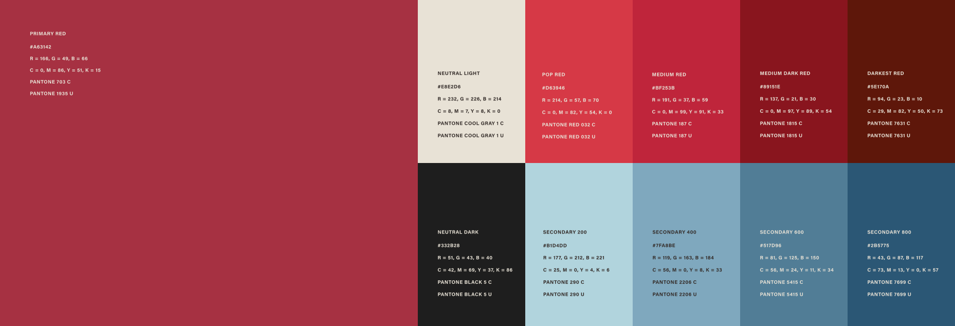
The new element in the system is what we called the Cornerstone Wave. I cropped the corner of the refreshed LCC mark, rotated it, and drew it as an icon of its own: an abstract cornerstone. A cornerstone is the first stone laid on a building, and everything after it is set from that stone, which made it a fitting metaphor for Loeffler’s ethos. Repeated outward, the same shape becomes a wave, the ripple a finished school or civic building sends through the community around it. In the pattern version, the wave always radiates from a bottom corner, so it grows from the ground up the way a building does.
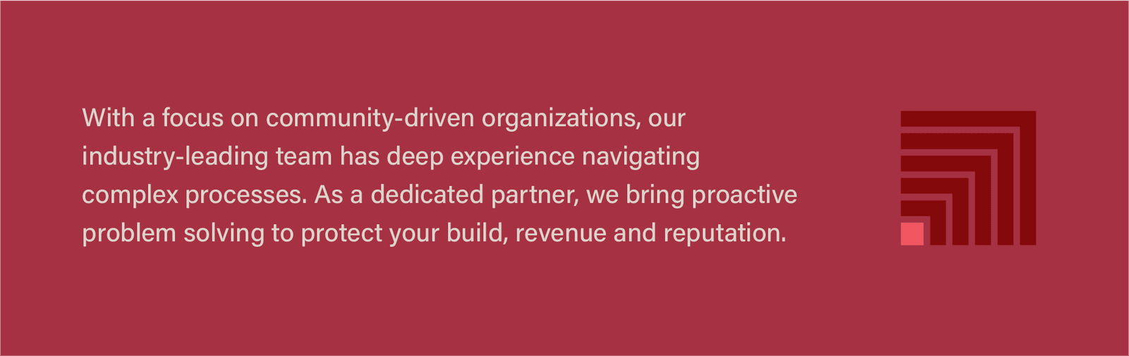
The refresh landed on Loeffler’s fifteenth anniversary, so the system also picked up a set of 15-year marks, the cornerstone pattern, a drafting grid, and a line-art version of the LCC mark, where separate runs of line come together into one form, for backgrounds and large-format pieces.




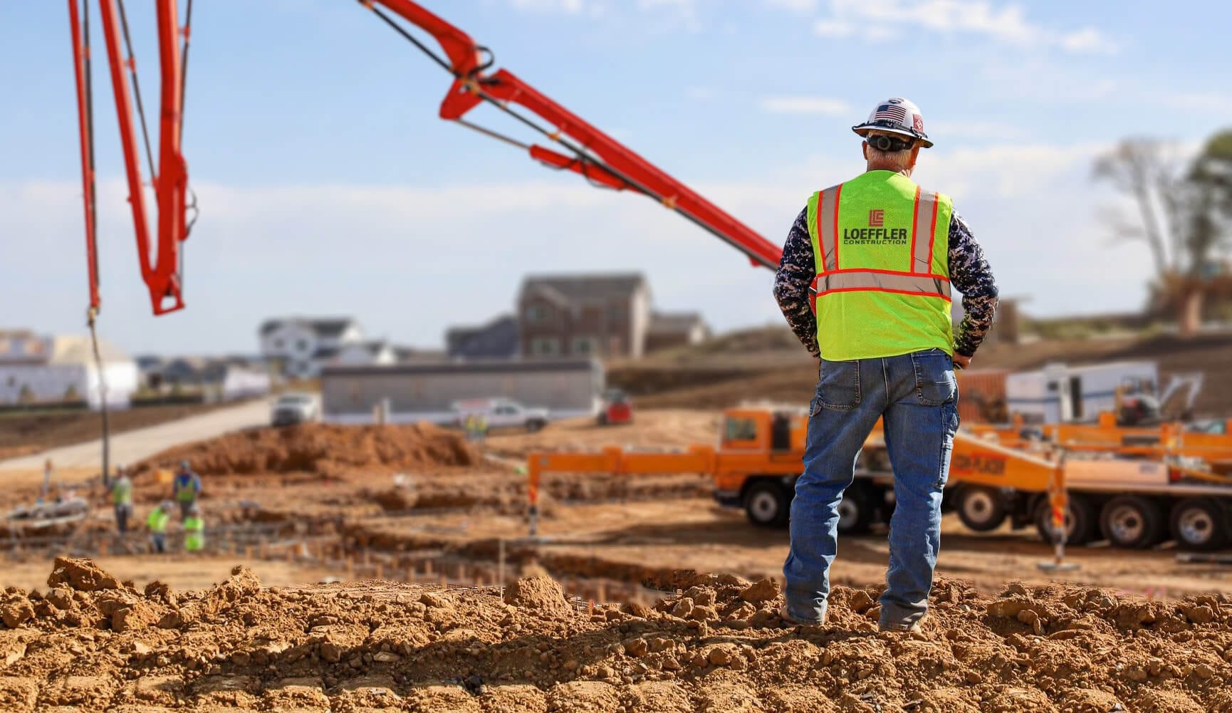
Photography puts people first. The strategy work showed that Loeffler’s people are central to how clients experience the company, so the direction pairs the finished buildings with crews at work on job sites. Photos run in full color for warmth, sometimes under a light wash of Loeffler red.
Applications
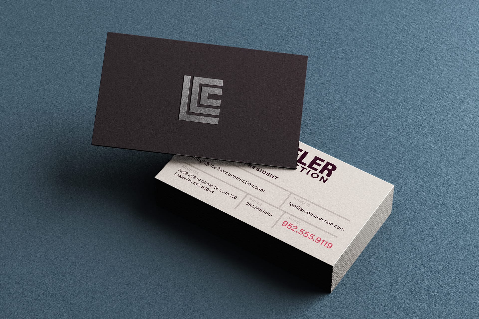
I worked closely with a production designer to build out the system in InDesign, Word, and PowerPoint templates for proposals, presentations, stationery, and other applications. We handed over all of the brand assets and files, as well as an in-depth brand guidelines document they could use to take the brand and run with it themselves. The business cards got a silver foil treatment.
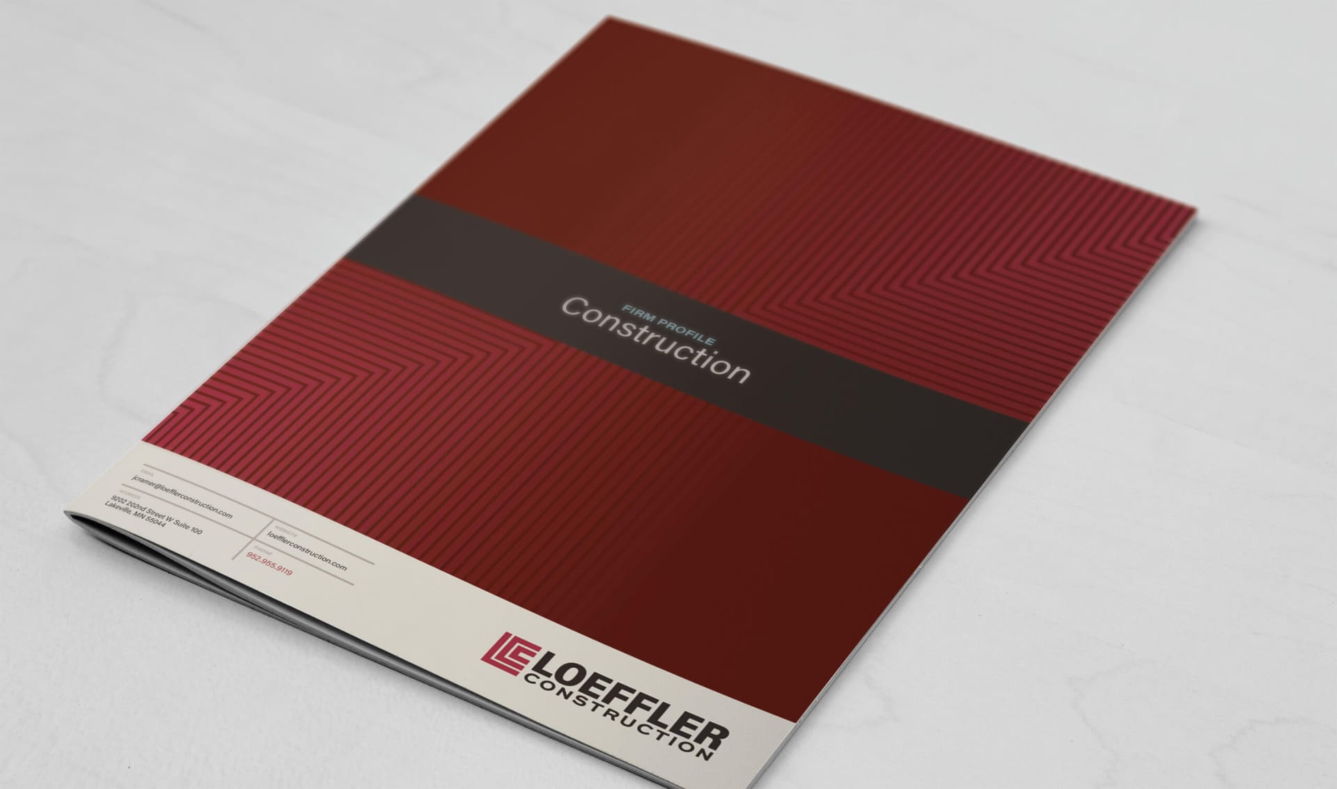
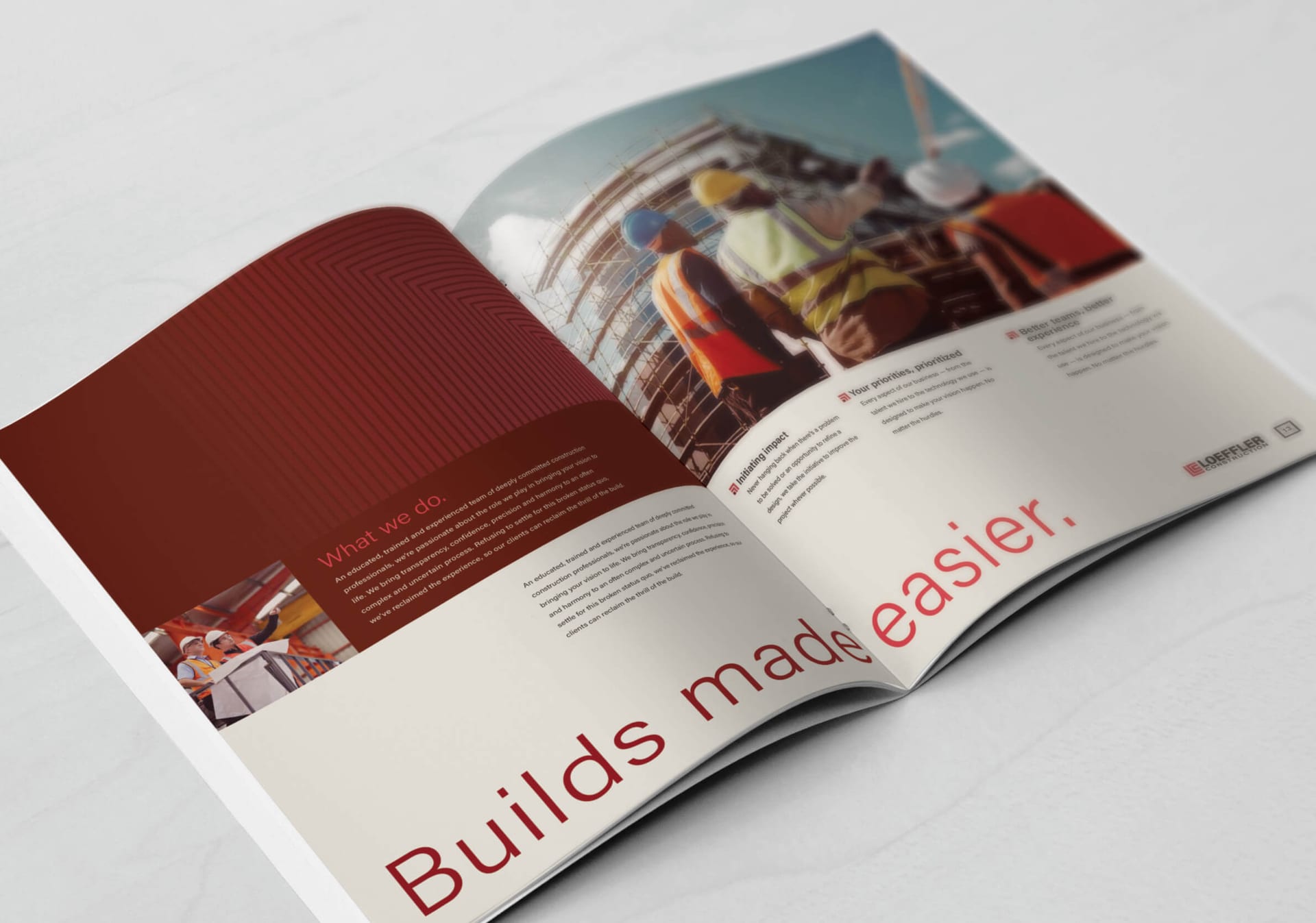
My favorite piece is a presentation folder for proposals and first introductions, closed with a red paper band and paired with branded scissors, so the recipient opens it with a ribbon cutting. The thinking was to begin with the end in mind: before a prospect reads a word of the proposal, they’ve already felt what it’s like to celebrate a finished building with Loeffler. And they get to keep the scissors.
Website
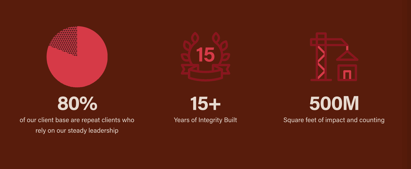
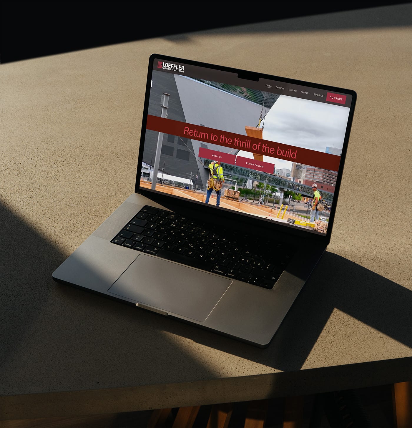
As with Rockwise, I designed the site and built the Squarespace templates, Eliza wrote the bulk of the content, and the Loeffler team finished the remaining pages. It’s live at loefflerconstruction.com.
Because I’d designed the Rockwise mark with this refresh in mind, the two now sit together as one family: a construction firm and its consulting arm, clearly related, clearly different.
The marketing team now runs the brand themselves, in proposals, at events, and on social. That’s the outcome I care about most.
Related Projects



Want to work with me?
Get in touch →