
Rockwise Strategies brand identity and website
In addition to building commercial structures, Loeffler Construction offered owner’s representation and cost consulting, and wanted to know whether that side of the business should stand on its own. Kassel & Co (then operating as Lake & Pine) laid out the brand architecture options and their tradeoffs, and Loeffler chose a separate brand: Rockwise Strategies, a Loeffler company.
Eliza Anne Green, the independent strategist we partner with on this kind of work, led the research, strategy and naming. I reviewed her thinking closely and agreed with nearly all of it, so I mostly stayed out of her way. My job started where the strategy stopped: turning “the guide who knows how it’s built” into something you can see.
Visual identity
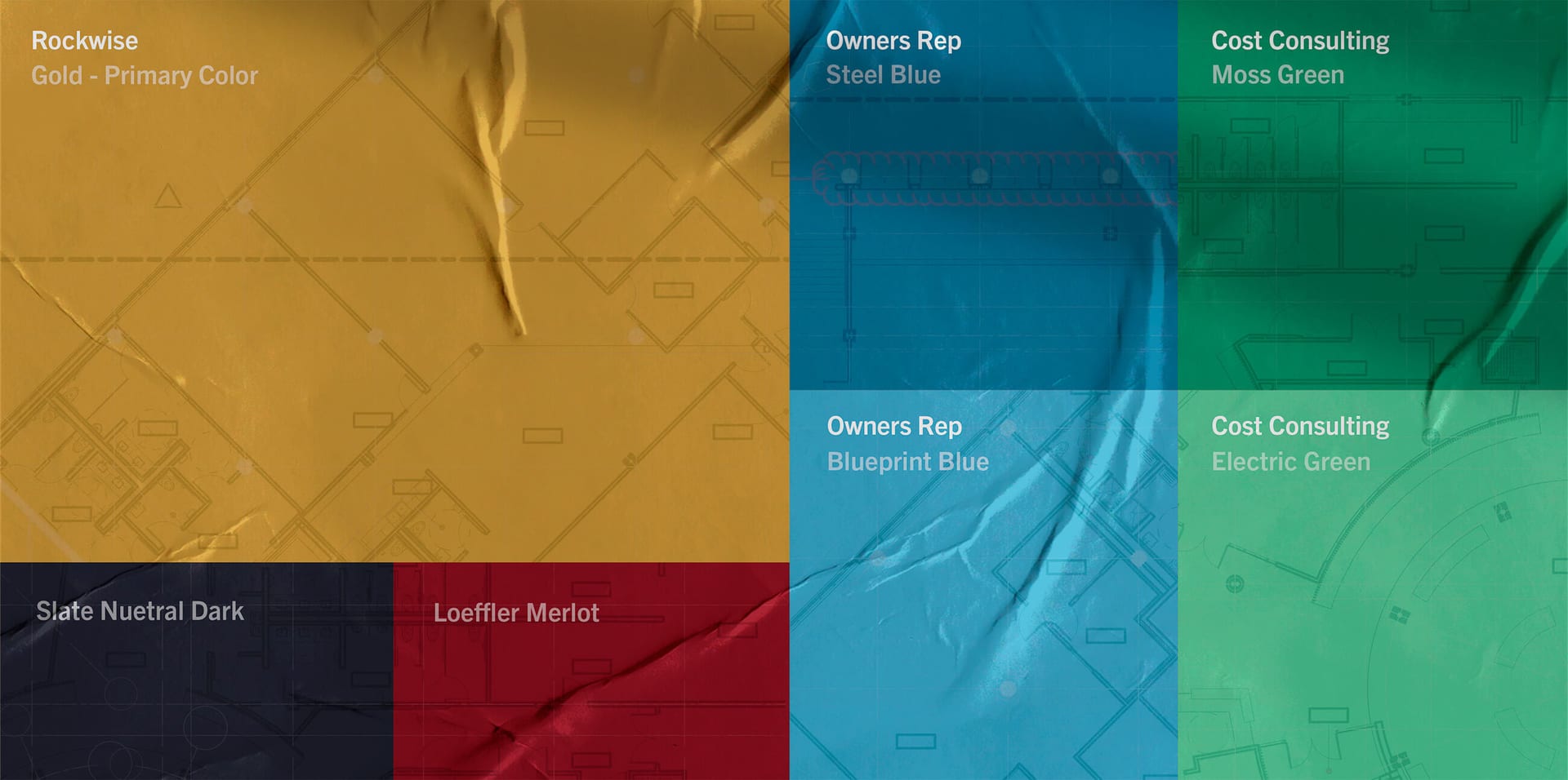
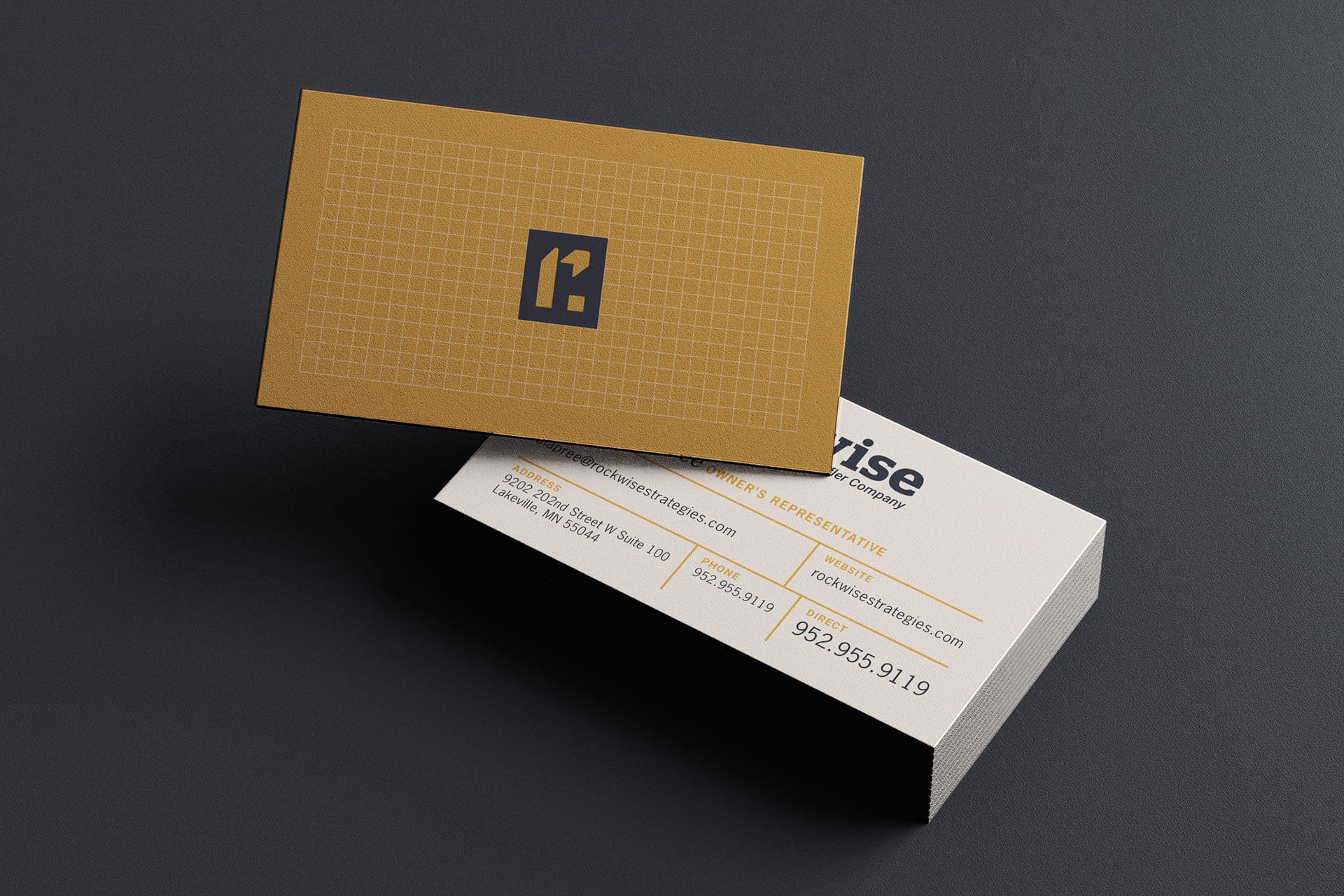
I designed the identity and did most of the production design myself. The strategy cast Rockwise as a guide who knows how things get built, and the mark carries both halves of that. The lowercase r doubles as a construction crane, a nod to the hands-on building knowledge that pure consultants often lack. Its arm is a compass, and wherever the compass appears on its own it points up and to the right, toward forward momentum. The square holding it all together stands for stability. Gold leads the palette for confidence and expertise, and a touch of Loeffler’s merlot keeps the family tie without letting the parent brand take over.
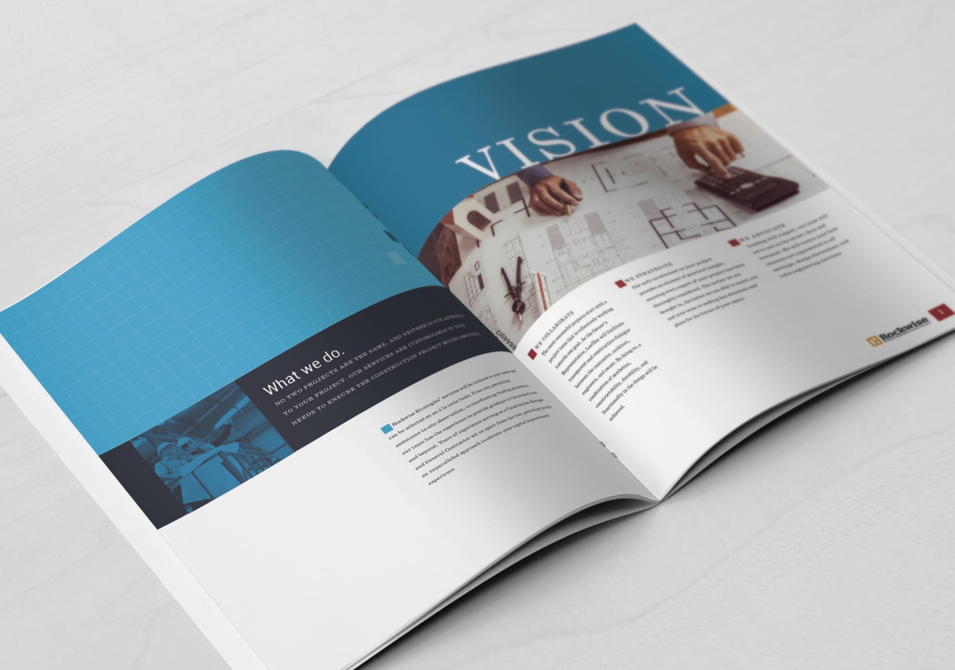
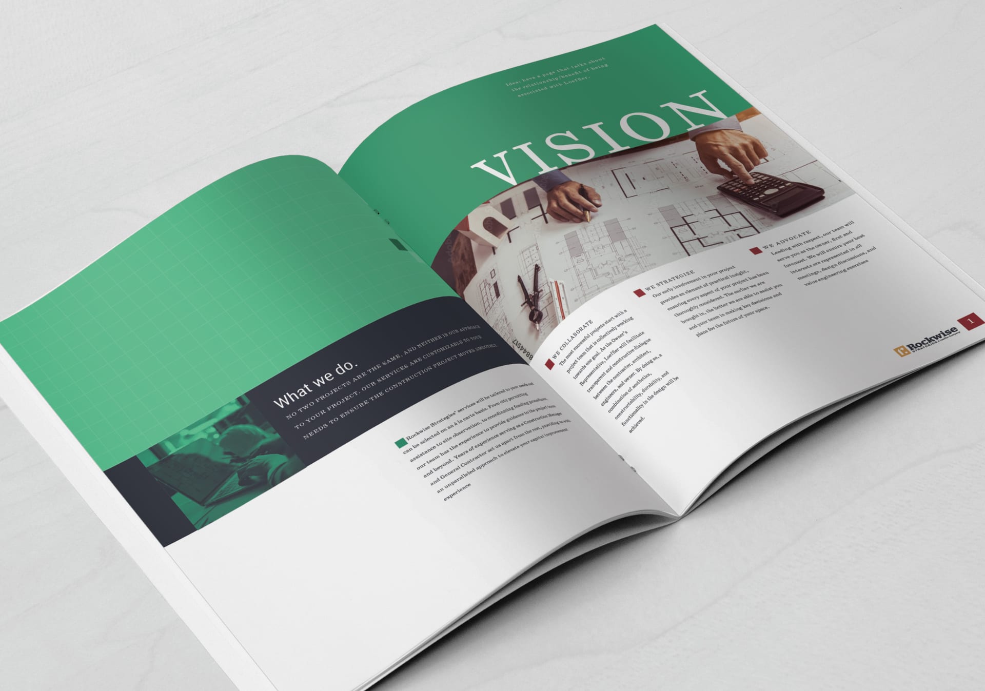
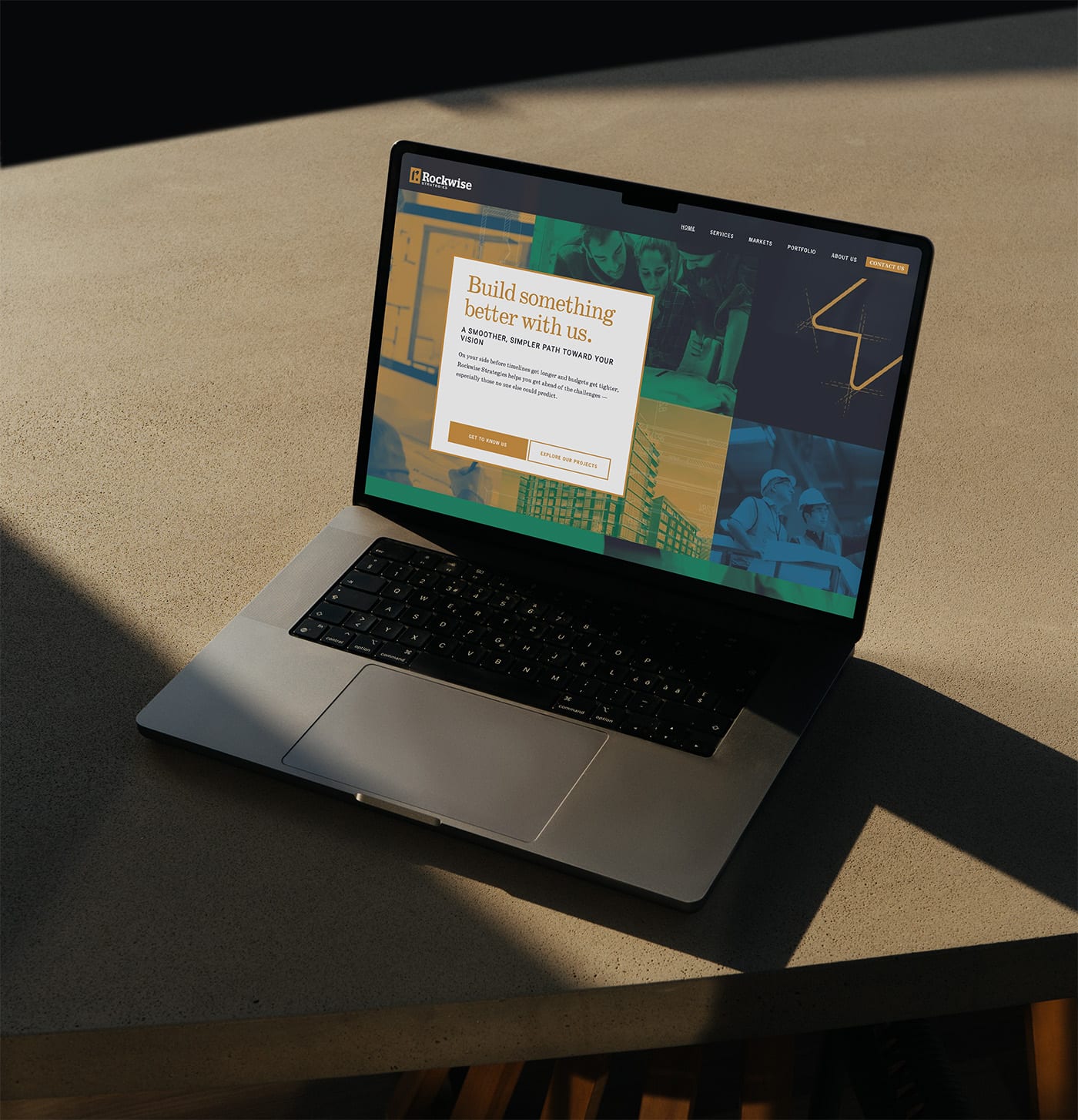
The decision I’m happiest with is the color zoning. Owner’s representation lives in blues and cost consulting in greens, so a proposal or a web page tells you which side of the business is talking before you read a word.
Grids run through the whole system. Layouts sit on a strict square grid, the r mark is built on one (the back of the business card shows it), and the hero graphics are grids of duotone photos. It’s a quiet way of signaling planning and precision, fitting for a firm that prices and manages buildings. Every so often a layout breaks the grid on purpose, so the brand reads as exact without feeling rigid.
Photography had a job too. A firm like this ends up with plenty of pictures of buildings, so I balanced them with photos of people collaborating in offices and on job sites. The idea was to let owners and architects see themselves in the pictures and get a sense of what a successful project with Rockwise looks like. Duotone versions in the brand colors carry the hero graphics, and full-color photos take over inside the firm profiles and case studies.

Website
I designed the site and built the templates in Squarespace, then handed it over so the Rockwise team could finish populating content and build out the remaining pages themselves. It’s live at rockwisestrategies.com.
Built to sit next to Loeffler
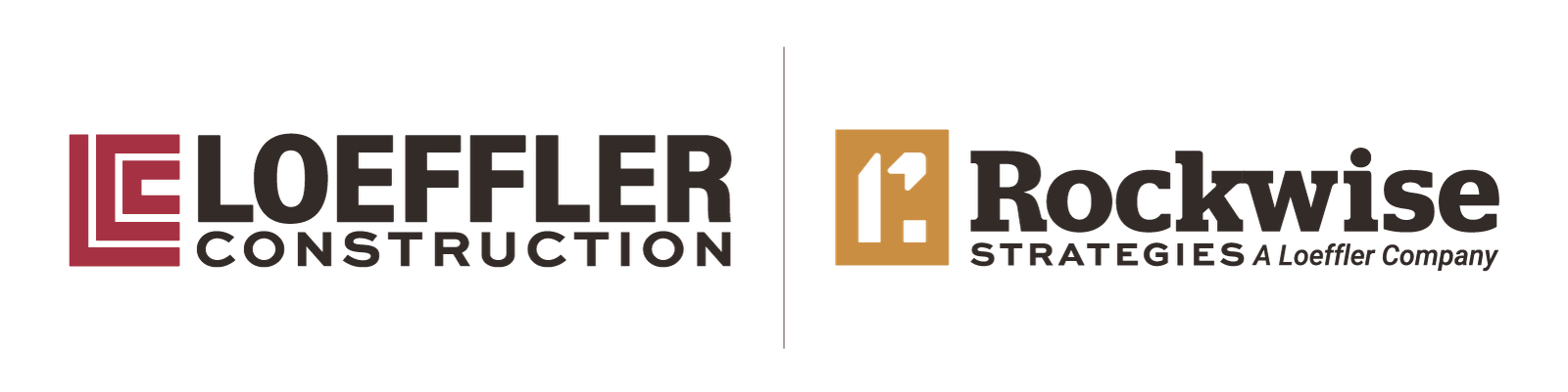
Loeffler’s own identity hadn’t been touched yet, so I drew the Rockwise mark with that future refresh in mind, matching its geometry and weight to what the parent brand would become. When Loeffler came back a little later for its own evolution, the two marks already locked together.
Related Projects


Want to work with me?
Get in touch →