
DiSCProfile: The place to buy DiSC
DiSCProfile.com sells DiSC assessments, and so do plenty of other distributors, often the exact same products. The site had to stand apart from everyone else selling them. Over the years Kassel & Co redesigned the store, gave a separate educational site its own look, and eventually merged the two. I led the visual design throughout, working with UX strategist Callie Meyers of Common Marvel on the big site overhauls.
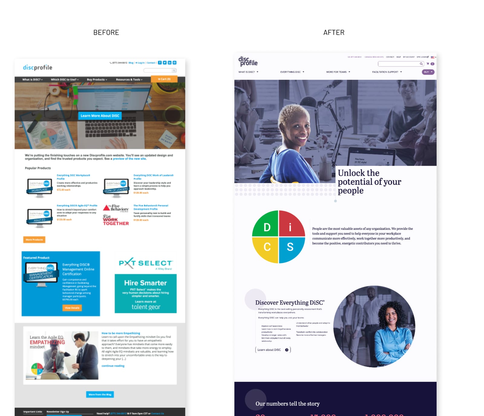
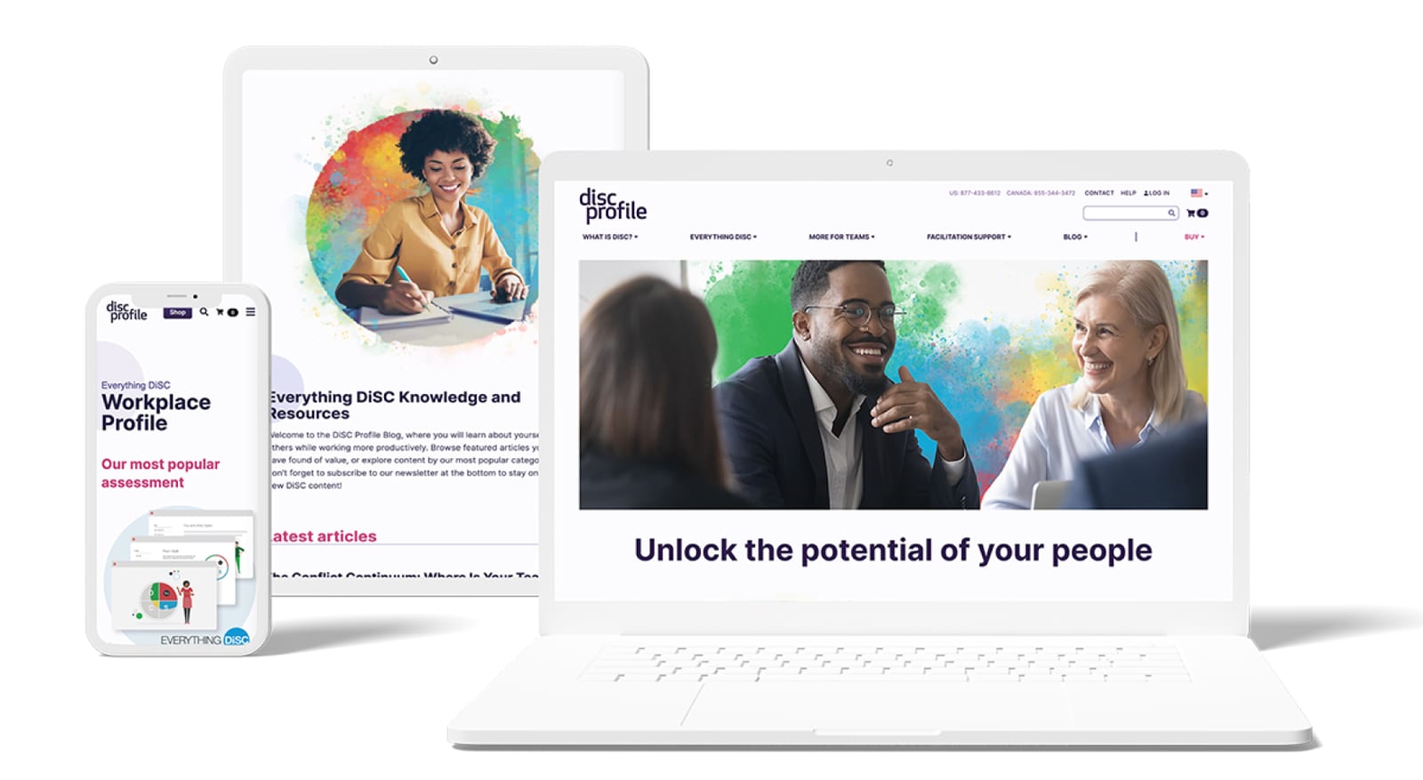
Blue was everywhere in the category, so the store redesign started there. I moved the brand to plum and navy, refreshed the logo so it held up at small sizes like social avatars, and tested type, color, and imagery on style boards before designing any pages.
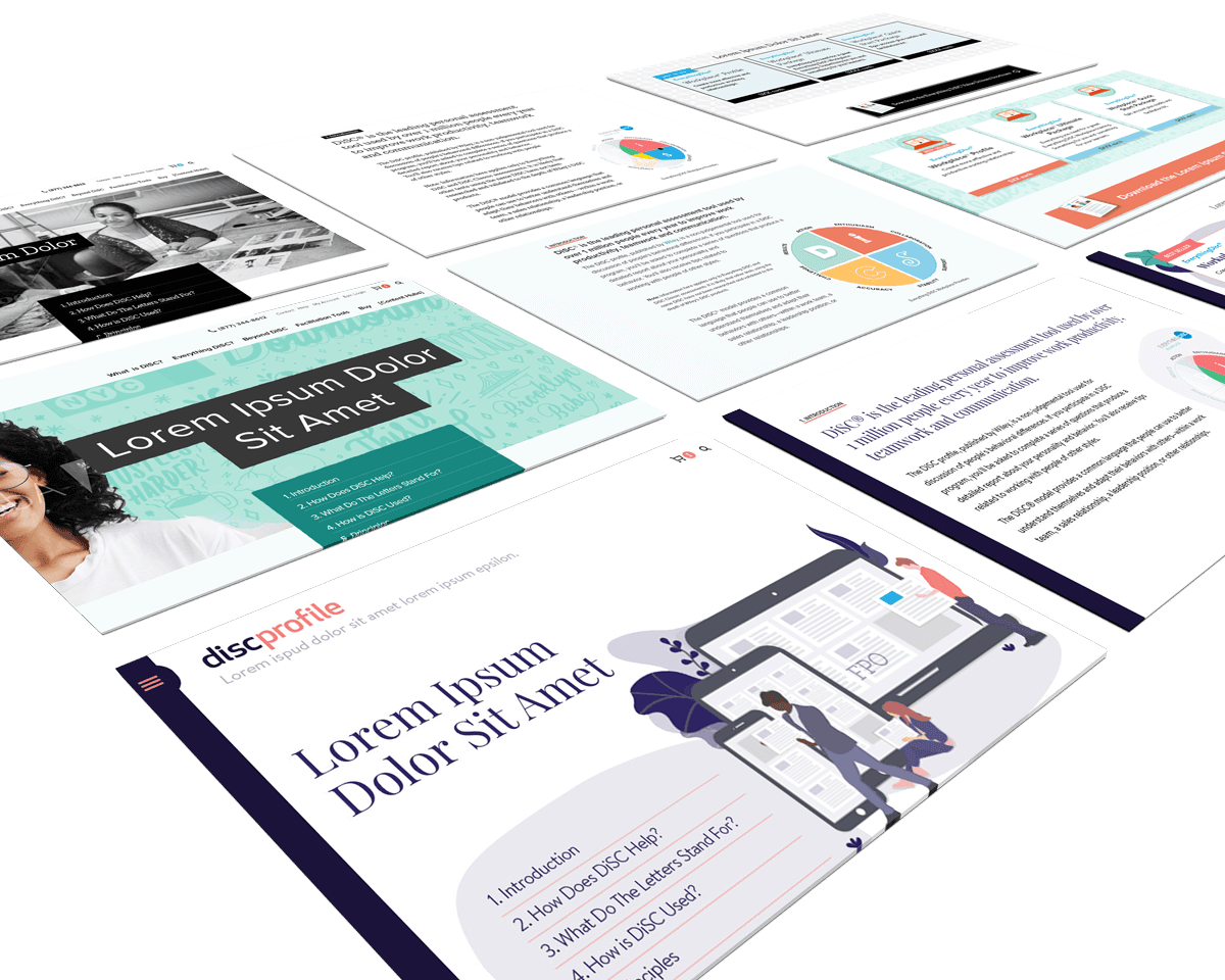
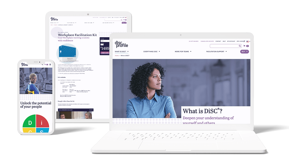
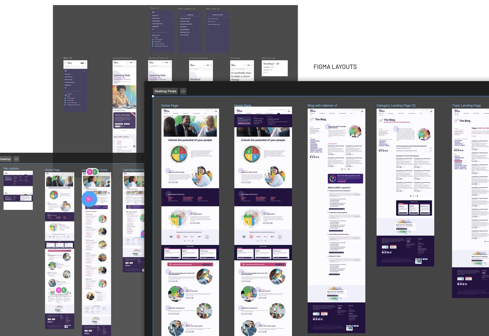
From there I designed the store’s key templates to make a large family of related products easier to tell apart, with a clearer path to checkout. I reviewed the build against the approved designs as it moved through development.
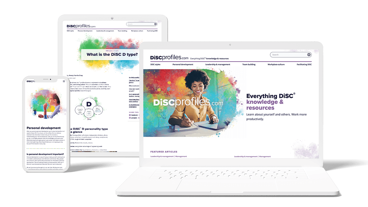
Search was how most people found DiSC, and paid advertising was limited, so the company also ran a separate educational site, DiSCProfiles.com, to answer the questions people were already asking. That let the store focus on buying. I gave the learning site a couple of facelifts, keeping it related to the store but distinct, and each round pushed the visual language further.
Eventually the client’s SEO specialist recommended moving the educational content onto the store’s domain. My job was to carry the learning site’s newer look into the store so the two read as one site, with pages that teach what DiSC is sitting alongside pages that sell it.
Related Projects




Want to work with me?
Get in touch →